10 Meta Ad Design Tips for Better Results

Creating Meta ads that perform well starts with great design. Here’s what you need to know:
Creativity drives results: 56% of a campaign's sales ROI comes from strong creative design.
Mobile-first focus: 98% of Facebook users are on mobile. Design for mobile to grab attention in just 1.7 seconds.
Key design elements:
Layout: Guide user focus.
Color: Bold colors outperform muted ones by 19%.
Typography: Use clear, easy-to-read fonts.
Quick Tips to Improve Your Ads:
Design for mobile users first (use vertical or square formats, keep videos under 15 seconds, and add captions).
Use strong, vibrant images that align with your brand and stand out.
Write short, clear copy (stick to Meta's character limits and focus on value).
Incorporate brand elements like logos and colors without overcrowding.
Use white space effectively to improve clarity and focus.
Pick colors that evoke emotions (e.g., blue for trust, red for urgency).
Make key elements stand out with contrast and visual hierarchy.
Add a clear call-to-action (CTA) that’s visible and action-oriented.
Test different versions of your ads to find what works best.
Align design with your campaign goals (e.g., awareness, lead generation, or conversions).
These tips can boost click-through rates, conversions, and ROI for your Meta campaigns. Focus on strong visuals, concise messaging, and mobile-friendly design to see better results.
8 Facebook Ad Design Tips and Examples!
1. Design for Mobile Users First
A whopping 98% of Facebook users access the platform on their mobile devices [2]. And mobile users spend just 1.7 seconds looking at content on Facebook's mobile feed, compared to 2.5 seconds on desktop [1]. This makes a mobile-first approach essential if you want to grab their attention quickly. Here’s how to make your ads shine on mobile.
Why Mobile Matters
Research shows that mobile-optimized ads can lead to 27% higher brand lift compared to standard video ads [3]. To make the most of this, focus on the following:
Key Tips for Mobile Ads
Choose the Right Format
Use vertical (9:16) for Stories and Reels.
Use square (1:1) for in-feed ads.
These formats take up more screen space, making your ads more visible and engaging [2].
Make Visuals Stand Out
Start with bold, attention-grabbing visuals.
Deliver your key message in the first 3 seconds.
Keep videos short - 15 seconds or less.
Design for silent viewing by adding captions or text overlays.
Use high-resolution images to ensure clarity on smaller screens [3].
Mobile Performance Stats
Mobile ads see a 1.65% click-through rate compared to just 0.65% on desktop[4].
90% of Instagram users access the platform via mobile [4].
Optimizing for mobile can lead to better CPC and conversion rates [2].
Technical Tips for Success
Compress images and videos to ensure faster load times.
Leverage Meta's Instant Experience for immersive, mobile-friendly ads.
Test your ads on different devices and network speeds to ensure they perform well everywhere [2].
Since mobile users are often on the go, your design needs to be clear and to the point. Use minimal text, legible fonts, and a strong call-to-action. By focusing on these mobile-specific strategies, you can significantly improve your ad's performance.
2. Pick Strong Images
Once you've optimized your mobile layouts, pair them with eye-catching visuals. Great visuals are key to creating Meta ads that perform well. With users spending just seconds scrolling through their feeds, your images need to grab attention instantly and communicate your message clearly.
What Makes Images Stand Out
Certain visual elements are known to boost engagement:
Vibrant colors that pop against Meta's blue interface
High-quality photos or graphics
Human faces, especially when they're looking directly at the viewer
Simple compositions that convey your message quickly
Brand-consistent visuals that align with your overall style
Proven Image Strategies
Color Choices
The colors you use can make or break your ad's performance. For instance, Tough Mudder effectively incorporates bright orange in their ads to catch the eye while staying true to their branding [5]. If your brand uses a lot of blue, try adding bold borders or contrasting backgrounds to stand out on Meta's platform.
Human Faces
Use natural expressions and clear, visible faces to create a sense of connection. People are drawn to authenticity, so avoid overly staged or artificial poses.
"Images are the first impression a client or customer receives for your business. One strong, captivating image can mean the difference between customers reading the rest of your ad or not." - Stephanie Henshaw, Social Media Manager at Marwick Marketing [6]
Now, let’s look at the technical side of things to ensure your images perform their best.
Technical Requirements
To make sure your images look great on all devices:
Use high-resolution images that stay sharp across screens.
Keep text minimal to comply with Meta's ad guidelines [7].
Stick to clean, uncluttered designs for better impact.
Use the correct aspect ratios for your ad placements.
Testing and Optimization
Experiment with different image variations and monitor these key metrics:
Click-through rates
Engagement levels
Conversion rates
Audience retention
"Meta recommends minimizing text on images to improve performance and comply with ad guidelines. Too much text can clutter the ad and lower click-through rates, so stick to a simple phrase or slogan that grabs attention." - Instapage.com [7]
3. Write Short, Clear Copy
Once your visuals grab attention, your copy needs to pack just as much punch. On Meta platforms, every word counts due to strict character limits.
Character Limits Matter
Meta platforms enforce specific text restrictions [8]:
Primary text: 125 characters
Headlines: 40 characters
Link descriptions: 30 characters
These limits push you to be precise and impactful.
Writing for Impact
Lead with Value
Highlight what your audience gains immediately. TaskRabbit nails this with phrases like: "Getting everything done is easier than you think", "Hire a tasker instead", and "We've got chores covered"
[9].
Use a conversational tone
Write as if you're speaking directly to one person. SoFi's ad copy is a great example: "Pay off loans faster"
[9].
Length Affects Engagement
According to BlitzMetrics:
Posts between 120–139 characters enjoy 13.3% higher engagement compared to longer ones.
The average Facebook post has 157.7 characters.
Mobile posts tend to be shorter, averaging 104.9 characters [10].
"Good ad copywriting can persuade your audience to click through to your website. Good copywriting functions as a guide - it shows people where they need to go." - Emma Siemasko, Author at WordStream [9]
Optimization Tips
Start with your core benefit.
Add supporting details.
End with a clear call-to-action.
Use action-driven words (e.g., replace "Learn more" with "Get started").
AdEspresso analyzed over 37,000 Facebook ads and found the best lengths for each element:
Headlines: 5 words
Main text: 14 words
Descriptions: 18 words [11].
"Value proposition is something real humans are supposed to understand. It's for people to read." - Peep Laja, ConversionXL [12]
4. Add Your Brand Elements
Incorporating your brand elements effectively can enhance recognition and build trust - without overpowering your ad.
Key Brand Elements to Include
Logo placement: Make sure your logo is visible but not intrusive. Leave clear space around it (about 1/4 of its width) and stick to a minimum size of 16px in width for clarity [13].
Color scheme: Stick to your brand's primary colors throughout your campaigns. Ensure the colors have enough contrast to keep text readable.
Typography: Use your brand fonts, but prioritize readability, especially on mobile screens.
These elements should align with the design principles mentioned earlier, creating an ad that reflects your brand identity seamlessly.
Achieving Visual Balance
Your logo, colors, and typography should work together to support your ad's message. A well-balanced design ensures your brand stands out without taking attention away from the call-to-action.
Consistency Across Platforms
Consistency is key to building trust. When your branding is uniform across different platforms, it strengthens your credibility. As Vikas Agrawal from Infobrandz states:
"Consistency builds familiarity - the cornerstone of customer trust!" [14]
Tips for Integrating Brand Elements
Focus on hierarchy: Highlight your value proposition first, with the logo taking a secondary role. Use brand colors to draw attention to important details.
Stay distinct: Use your unique branding elements and avoid generic visuals that dilute your identity.
Match your landing page: Ensure your ad design and landing page share the same visuals, tone, and messaging for a cohesive experience.
Logo and Branding Dos and Don’ts
Avoid making changes to your logo, like altering its color, adding 3D effects, shadows, outlines, or combining it with emojis. These tweaks can reduce professionalism and weaken brand recognition.
5. Use Empty Space Well
When designing Meta ads, don't underestimate the power of empty space, often called white space. It’s not just about aesthetics - white space can direct attention, make your message clearer, and even boost ad performance.
Why White Space Matters
Studies reveal that proper spacing, whether between lines of text or around key elements, can enhance comprehension by up to 20% [17]. White space comes in two types: macro space (large areas around main elements) and micro space (small gaps between text or details). Both play a role in creating a clear, engaging design.
Tips for Effective Spacing
To achieve a polished, professional look, include enough white space in your ad. A clean layout not only highlights your main message but also makes your design visually appealing.
How It Impacts Ad Performance
Experts agree on the value of white space in ad design. Muhammad Sajid, SEO Expert at Lead Marketing, puts it this way:
"White space in online ads can be utilized to enhance focus by reducing clutter, highlighting key elements, guiding the viewer's eye, and creating a clean, visually appealing layout." [15]
Mistakes to Watch Out For
Crowding your ad with too many elements or squeezing them too close to the edges can hurt its effectiveness. Tight spacing between lines makes text harder to read, and failing to account for mobile users can reduce your ad's impact.
"In digital ads, white space is crucial. Keep it simple: don't overcrowd. Allow breathing room around key elements. It guides the viewer's eye and enhances clarity. Remember, less can be more impactful!" [15]
Mobile-Friendly Spacing
Mobile ads especially benefit from smart use of white space. By maintaining proper spacing and safe zones, you can make your design more user-friendly. Ads with ample white space have shown up to a 39% higher click-through rate compared to crowded designs [16]. Prioritizing white space is a simple way to make your mobile-first ads stand out.
6. Pick the Right Colors
Research suggests that people often base product choices on color within just 90 seconds of interaction [21]. Let’s break down how to use color effectively in your designs.
How Colors Influence Perception
Colors can evoke specific emotions and behaviors. For instance, blue conveys trust and security, while red creates a sense of urgency and energy [18]. Knowing these associations can guide your design choices.
Here’s a quick reference:
Color | Emotional Response | Best Used For |
|---|---|---|
Blue | Trust, Security | Tech products, financial services |
Green | Wealth, Action | Budget offers, eco-friendly products |
Red | Urgency, Excitement | Sales, limited-time offers |
Orange | Energy, Engagement | Call-to-action buttons |
Purple | Calm, Luxury | Premium items, female-focused ads |
Black | Sophistication | Professional services |
Practical Tips for Using Colors
Even small color adjustments can make a big difference:
Adding a colored border to your ad image has been shown to double click-through rates [18].
Switching a CTA button color from green to yellow boosted conversions by 14.5% in one study [18].
A Performable experiment revealed that red CTA buttons outperformed green ones by 21% [20].
Gender Preferences in Colors
Color preferences can differ by gender. For example, 57% of men prefer blue, compared to 35% of women [19]. On the other hand, purple appeals to 23% of women, but it’s not as favored by men [18]. Keep these insights in mind when targeting specific demographics.
Experimentation and Testing
A/B testing is key to finding the best color combinations for your audience. Try variations in background colors, CTA buttons, text highlights, and borders. Make sure there’s enough contrast for readability and a clear visual hierarchy. For example, in a blue-themed ad, accents of orange, red, or yellow can make key elements pop [18].
Consider Cultural Differences
Colors can have different meanings across cultures. While sticking to your brand’s core palette, test variations that align with local preferences. What works in one region might not resonate in another, so adapt thoughtfully for diverse audiences.
7. Make Elements Stand Out
To make your Meta Ads grab attention in crowded social feeds, focus on strategic contrast. Pair strong mobile layouts, bold images, and clear copy with contrasting design elements to highlight key parts of your ad. This creates a visual hierarchy that naturally draws viewers' eyes to what matters most.
How to Use Contrast Effectively
Strategic contrast relies on combining design elements to emphasize focal points. Here are some common types of contrast and how to use them:
Contrast Type | Purpose | Best Practice |
|---|---|---|
Color | Highlight key elements | Use dark backgrounds with light products or text |
Tonal | Add depth | Pair darker tones with lighter ones |
Visual | Direct attention | Surround key elements with empty space |
Typography | Improve readability | Mix serif and sans-serif fonts for variety |
Color Contrast in Action
Thoughtful color choices can make or break your ad's impact. For example, when Sonos promoted their speakers, they used a rich brown backdrop to subtly highlight the black speaker. This created a visually appealing focal point without overwhelming the viewer [22].
Typography Tips for Better Contrast
Typography can also play a big role in making your ad stand out. Use darker text on light backgrounds or lighter text on dark backgrounds. Mix styles like italic and uppercase to add variety, but always ensure readability. Small tweaks like these can lead to noticeable performance boosts.
Real-World Example: Maurices' Success
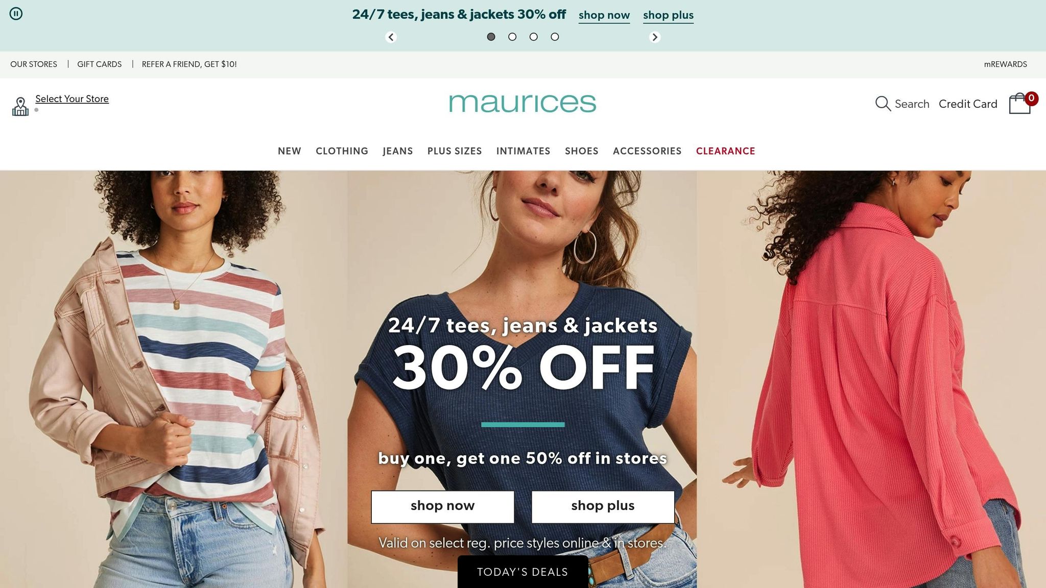
Maurices saw impressive results by using contrast effectively in their Collection ads. Their approach led to a 67% higher click-through rate and a 51% higher return on ad spend [23].
Drawing Attention With Visual Techniques
Simple tricks like using a yellow highlight on a dark background (as seen in a sports goggle ad) or enhancing a discount message with focused lighting can make a big difference. Adding empty space around focal points also helps guide attention naturally. These techniques ensure your audience notices the most important elements, whether it’s a product, message, or call-to-action [22].
Test and Optimize
Don’t just guess - test! Use A/B testing to experiment with different contrast combinations and see what works best for your audience. Fine-tuning your design ensures the key elements of your ad are instantly recognizable and engaging [24].
8. Add a Direct Call-to-Action
A direct call-to-action (CTA) is your ad's nudge that turns passive viewers into active participants. Paired with strong visuals and concise copy, a clear CTA can guide your audience toward taking the next step - whether that's clicking, shopping, or signing up.
How to Design an Eye-Catching CTA
Your CTA button should stand out while blending seamlessly with your ad's design. Here's a breakdown of key elements and their impact:
Element | Best Practice | Impact |
|---|---|---|
Button Color | Use colors that contrast with the background | Makes the button more noticeable |
Text Style | Keep it action-oriented and concise | Provides clear direction |
Placement | Align with natural eye movement | Encourages more interactions |
Visual Space | Leave plenty of space around the button | Ensures the CTA stands out visually |
By combining these elements, your CTA will not only grab attention but also drive users to act immediately.
Writing CTA Text That Works
Words matter. Instead of generic phrases like "Click Here", use text that highlights value and urgency. For example, something like "Shop Now & Get 20% Off Today!" is more compelling because it combines a direct action with a clear benefit [26].
A Real-World Example
Take Brooks Running as an example. They use CTAs like "Find out when we have more" for out-of-stock items. This button connects users to SMS notifications, turning what could have been a missed sale into future opportunities for engagement.
Where to Place Your CTA
The placement of your CTA is just as important as its design. For video ads, overlays such as "Tap to see more" can keep viewers engaged while encouraging interaction [26]. Think about how users naturally navigate your content and position your CTA accordingly.
Test and Refine
Experiment with different CTA designs and messages to see what resonates most with your audience. Track performance metrics and ensure that your landing page delivers exactly what your CTA promises.
Keep the Landing Page in Sync
Your landing page should align perfectly with your CTA. For instance, if your ad says "Book Now" for a local spa, send users directly to an appointment booking form [25]. This seamless experience builds trust and boosts conversions.
9. Create Different Versions
Testing different ad versions is a smart way to improve Meta ad performance and prevent ad fatigue.
Types of Creative Testing
Method | Description |
|---|---|
A/B Testing | Focuses on testing one variable at a time. |
Split-cell Testing | Examines multiple variables at once. |
Multivariate Testing | Explores all possible combinations of variables. |
Key Elements to Test
When testing, focus on these components to fine-tune your ads:
Visuals: Experiment with images and videos.
Ad Copy: Try different hooks and messages.
CTA: Change the text or placement of your call-to-action.
Format: Test formats like carousels, single images, or videos.
These tests build on earlier design strategies and help you refine your campaigns even further.
Best Practices for Testing
Run your tests for 1–2 weeks to gather reliable data.
Use Meta's Ads Manager to track metrics like click-through rates and conversions.
"Creative testing also helps you understand your target audience better", says Ioana Cozma from inBeat Agency. "We always use multiple ad creatives during the same campaign to appeal to different segments and reduce ad fatigue." [28]
Real-World Results
In testing for Unroll.me, inBeat Agency achieved impressive results:
91% lower CPA on Facebook
83% lower CPA on TikTok [28]
Use Automation to Scale
Once you've manually tested your ads, switch to automation to focus on the top performers. Meta's Advantage campaign budget tool can automatically allocate more budget to your best-performing ads [29].
Keep an Eye on Performance
Regularly monitor your ad performance. When engagement starts to drop, refresh your creatives to maintain results [27].
10. Match Design to Goals
To get the most out of your ad campaigns, your design should align closely with your objectives. Different goals call for different design strategies, so tailoring your approach can make a big difference in performance.
Design Elements by Campaign Type
Campaign Goal | Key Design Elements | Best Practices |
|---|---|---|
Brand Awareness | Strong visuals, storytelling | Grab attention in the first 3 seconds, use 1:1 and 9:16 formats |
Lead Generation | Forms, clear value proposition | Highlight CTAs, keep form fields minimal |
Sales Conversion | Product images, pricing details | Use action-driven visuals and purchase-focused CTAs |
Optimize for Campaign Length
Running longer campaigns (6+ weeks) can increase ROI by 16% and improve effectiveness by 98% [30].
Frequency and Reach Guidelines
For building brand awareness, aim for a weekly frequency of twice per user, reach at least 5 million unique users, and use automatic placements [30].
"Your conversions will continue to suffer if no one knows who you are", says Patrick Cumming, Head of Marketing at KlientBoost [31].
Keep Design Consistent
Your ad and landing page should feel like they belong together. This consistency strengthens your message and helps achieve your campaign goals. Focus on:
Using the same color palette
Maintaining similar visual styles
Matching the messaging
Aligning CTA language [34]
Platform-Specific Optimization
Every platform has its own quirks. Design your ads to meet the specifications of each channel to improve visibility, engagement, and conversions [33]. Adjust these elements to suit your audience for better results.
Audience Segmentation
Tailor your ad designs based on factors like demographics, buying intent, past interactions, and the platform they’re using [32]. This targeted approach ensures your content resonates with each audience segment, boosting campaign efficiency.
Conclusion
Let’s wrap up with the key takeaways for creating successful Meta Ads.
Meta Ads that combine strong design with insights from data deliver better results. In fact, using data-driven design can increase ROI up to 8x, boost click-through rates by 14%, and improve conversions by 10% [35].
What Makes Meta Ads Work?
Here are two standout strategies:
Mobile-First Focus: Optimizing for mobile can significantly lower customer acquisition costs and improve return on ad spend (ROAS). For example, Hurom reduced costs by 36% and achieved 2.5x ROAS using this approach [35].
Strategic Execution: A well-thought-out design strategy can lead to impressive results. BlueRidge Company, for instance, generates over $500,000 each month by applying these principles [5].
Why Expertise Matters
Collaborating with Meta Ad specialists can take your campaigns to the next level. Agencies like Dancing Chicken have a proven track record of delivering results.
"We tried countless agencies that overpromise and underdeliver. Mason is awesome! They consistently deliver results every time. We've finally found the right marketing partner." – Michael, Campbell & Company [5]
Their data-driven strategies have helped clients like Shiptronics become the #1 Seakeeper Ride dealer in the U.S., and Baja Construction secured a $100,000 project within just two weeks of launching their campaign [5].
Looking Ahead
Companies that prioritize data-driven design are 23 times more likely to attract customers and can boost brand awareness by up to 50% [35].